
7 Chart Types You Need to Know for Your HR Certification Exams
In order to understand and evaluate scenario (or what-if analysis) questions on your SHRM or HRCI certification exams, it’s important to know the difference between six types of graphic data analysis tools, or charts. These charts allow you to create a graphic representation of data in HR, so many scenarios will consider which is best for a specific scenario, or may show an example of data in one of these formats for you to identify. Here, we’ll review seven types of charts you’ll need to know for your HR certification exams.
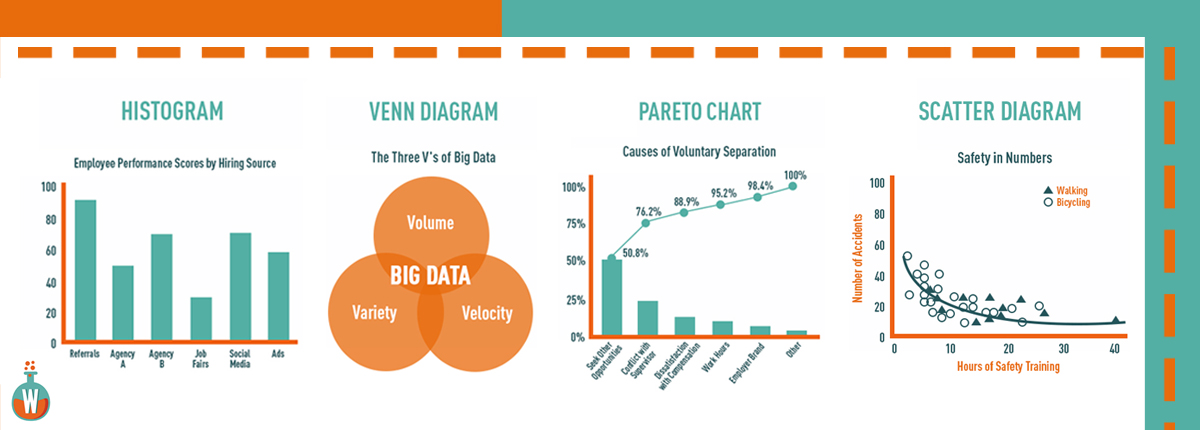
1) Histograms
A histogram is a chart that plots the distribution of a numeric variable’s values as a series of bars. Each bar typically covers a range of numeric values called a bin or class and each bar’s height indicates the frequency of data points with a value within the corresponding class. Histograms are used for showing general distribution of dataset variables. You can see roughly where the peaks of the distribution are, whether the distribution is skewed or symmetric, and if there are any outliers. STUDY TIP: Remember that the HISTogram is one of the best methods of showing HISTorical data.
2) Venn Diagram
Venn diagrams define all the possible relationships between collections of sets and can help simplify complicated processes. The most basic Venn diagrams simply consist of multiple circular boundaries describing the range of sets. The overlapping areas between the two boundaries describe the elements which are common between the two, while the areas that aren’t overlapping house the elements that are different.
STUDY TIP: Think of the qualities HR looks for that will help short-list candidates for a position, such as experience, professional skills and leadership competence. All of these qualities are different and may or may not be present in some candidates. However, a Venn diagram of this scenario helps indicate very simply that the best candidates will have all of these qualities combined.
Our content continues after the ad.


Ads help make OUR resources free for everyone.
We respect your privacy. To see our Privacy Policy
click here.
3) Pareto Chart
The name comes from the Pareto Principle – that 80% of effects come from 20% of causes – and this chart is most commonly used in quality assurance. The Pareto chart incorporates both a line graph and a bar graph; individual values are represented in descending order in bar form, while the line is the cumulative sum of the individual values. STUDY TIP: In HR, using this chart enables you to focus on solving the few causes that are generating the most problems to achieve a significant impact quickly.
4) Scatter Diagram
The scatter diagram graphs pairs of numerical data, with one variable on each axis, to look for a relationship between them. If the variables are correlated, the points will fall along a line or curve. STUDY TIP: The scatter diagram is also called “X-Y graph,” so remember that it will have data identified in variables of X and Y.
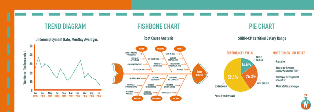
5) Trend Diagram
Trend diagrams are used to show trends in data over time. All processes vary, so single point measurements can be misleading. Displaying data over time increases understanding of the real performance of a process, particularly with regard to an established target or goal. STUDY TIP: Trend diagrams are typically used to identify patterns with data points that correlate with periods of time in order to analyze cycles or trends.
6) Fishbone Chart
The fishbone chart is a visual way to look at the cause and effect to help find reasons for variations, defects, or failures. The diagram looks like a fish’s skeleton with the problem at its head and the causes for the problem feeding into the spine. STUDY TIP: A fishbone diagram is useful in brainstorming sessions to identify possible causes of a problem and in sorting ideas into useful categories.
7) Pie Chart
The most basic and the one we’re all familiar with: Pie charts are generally used to show percentage or proportional data and usually the percentage represented by each category is provided next to the corresponding slice of pie. Pie charts are good for displaying data for around six categories or fewer. STUDY TIP: HR often uses pie charts to demonstrate statistical breakdowns of a workforce, by salary range, age groups, survey responses, etc.